
Choosing the right house exterior colors can completely change how a home looks from the street. A fresh color scheme can highlight architectural details, complement the roof, and make an older house feel more updated without changing its structure.
However, choosing an exterior paint color is not as simple as picking a shade you like. The same color can look different in direct sunlight, under shade, or beside brick and stone. Your roof color, window frames, landscaping, and front door also affect the final result.
This guide explores 15 house exterior color ideas, explains which combinations work well together, and shares practical tips to help you choose a palette that suits your home.
What Are the Best House Exterior Colors?
Some of the most versatile exterior house colors include warm white, soft gray, greige, beige, sage green, navy blue, and charcoal. The best option depends on your home’s architectural style, existing materials, natural lighting, and personal preference.
For a balanced exterior, start with one main wall color, choose a complementary trim color, and use a third shade for selected features such as the front door or shutters. Always test paint samples outdoors before committing to the full project.
15 House Exterior Colors and Combinations to Consider
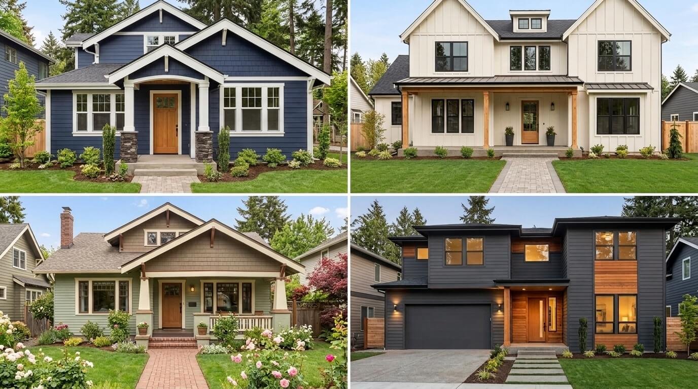
The following ideas offer different looks, from traditional and understated to modern and bold. Use them as starting points rather than strict rules because the best combination depends on your home’s materials and surroundings.
1. Warm White With Dark Trim
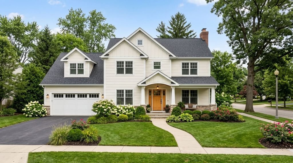
Warm white creates a bright, welcoming appearance without feeling as stark as some cooler whites. Pair it with charcoal or dark gray window trim to add definition and make the architectural details stand out.
This combination works particularly well on traditional homes, modern farmhouses, and simple contemporary designs.
Best for: Homeowners who want a clean exterior that is easy to coordinate with different landscaping styles.
Color combination: Warm white walls, charcoal trim, and a natural wood or muted black front door.
2. Soft Gray With White Trim
Soft gray is a practical choice for homeowners who prefer a neutral color with a little more depth than white. White trim around windows, doors, and roof edges can keep the exterior from looking too flat.
Pay attention to undertones. Some grays have blue or violet hints, while others lean toward beige. A gray that looks neutral on a paint card may appear noticeably cooler outside.
Best for: Traditional homes, suburban houses, and properties with white windows or darker roofing.
3. Greige With Cream Accents
Greige combines the appearance of gray and beige. It can create a balanced exterior that feels warmer than cool gray while remaining more understated than yellowish beige.
Cream trim and a brown or dark bronze front door can complement this palette. It is especially useful when the house has warm stone, tan brick, or earthy landscaping.
Best for: Homes where a warm neutral would connect the roof, walls, and outdoor surroundings.
4. Sage Green With Warm White Trim
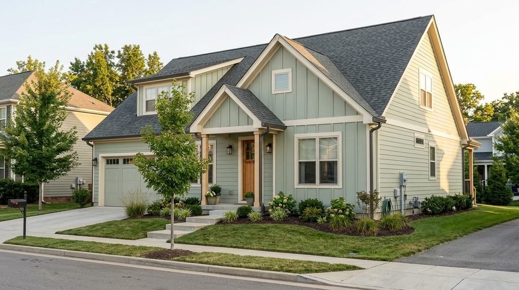
Sage green is a muted green that brings a natural feel to the exterior without looking overly bright. It pairs well with warm white trim, stone details, and wood accents.
The amount of natural greenery around the property matters. In a heavily landscaped setting, a softer sage can blend into the surroundings, while a slightly deeper green may provide more definition.
Best for: Cottages, modern farmhouses, and homes surrounded by trees or gardens.
5. Navy Blue With White Trim
Navy blue gives a house a deeper, more defined appearance. White trim creates contrast around windows and rooflines, while a natural wood door can soften the overall look.
Because navy is a darker shade, check how much direct sunlight the walls receive and whether the roof already creates a strong dark band above the exterior.
Best for: Coastal-inspired homes, traditional houses, and contemporary properties with simple architectural lines.
6. Beige With Brown Accents
Beige remains a flexible option for homeowners who prefer a warm and familiar exterior. Brown accents can connect the wall color with wood doors, earthy roof tones, and stone features.
To avoid a flat appearance, select shades with enough contrast to separate the walls from the trim. The colors should complement each other rather than compete for attention.
Best for: Homes with tan roofing, brown brick, stonework, or established gardens.
7. Charcoal Gray With Natural Wood
Charcoal gray creates a dramatic, modern appearance. Natural wood around the entrance, porch, or garage can add warmth and prevent the exterior from feeling too dark.
This combination often works best when the house has clean lines, simple trim, and enough natural light to show the wall details. On a heavily shaded property, a lighter gray may be easier to appreciate.
Best for: Contemporary homes and properties with simple, modern architecture.
8. Light Blue With White Trim
Light blue can give a house a fresh and relaxed appearance. White trim keeps the palette crisp, while gray roofing or natural wood accents can help balance the coolness of the blue.
Before choosing a shade, look at the color beside your roof and windows. Some light blues become much more saturated in bright sunlight than they appear indoors.
Best for: Coastal-inspired houses, cottages, and homes with porches or white architectural details.
9. Olive Green With Cream Trim
Olive green is deeper and earthier than sage. It can work well with cream trim, dark brown doors, stone paths, and natural landscaping.
A muted olive is generally easier to coordinate with existing materials than a highly saturated green. Test the shade against your roof because some olive tones can look noticeably yellow beside warm roofing.
Best for: Traditional homes, country-style properties, and houses with natural stone or timber accents.
10. Cream With a Muted Blue Front Door
A cream exterior provides a soft neutral background, while a muted blue front door adds a little personality without requiring several competing colors.
This is a useful approach if you want a subtle exterior refresh rather than a dramatic change to the whole house.
Best for: Smaller houses, traditional homes, and properties where the entrance is a key visual feature.
11. Taupe With White or Off-White Trim
Taupe sits between brown and gray, making it a useful option for homes with mixed warm and cool materials. Off-white trim can create a gentle contrast without the sharp appearance of bright white.
Check the color beside existing brick, stone, and roofing. Taupe shades can shift toward purple, pink, or yellow depending on their undertones and the surrounding colors.
Best for: Homes with mixed masonry, neutral roofing, and traditional exterior details.
12. Soft Yellow With White Trim
A soft, muted yellow can give a home a cheerful appearance without overwhelming its surroundings. White trim and a simple dark roof help keep the palette organized.
Avoid choosing a yellow based only on how it looks on a small paint card. Strong sunlight can make some yellow shades appear much brighter on a large exterior wall.
Best for: Cottages, traditional houses, and homes where a warmer exterior suits the architectural style.
13. Brick Red With Cream Accents
Muted brick red can add character to a house, particularly when paired with cream trim and dark, understated accents. It can also work as a feature color for selected architectural sections rather than covering every exterior surface.
If the home already has exposed red brick, consider whether painted red areas will complement it. Slight differences in undertone can make two similar reds look mismatched.
Best for: Traditional architecture, cottages, and homes with established masonry details.
14. White With Black Accents
White walls and black accents create a high contrast look often associated with modern house colors. Black can be used on window frames, the front door, shutters, or selected trim details.
The key is to use dark accents consistently. If every small feature receives a different color, the exterior may feel visually busy.
Best for: Modern farmhouses, contemporary homes, and houses with simple shapes.
15. Earthy Brown With Sand-Colored Trim
Earthy brown works well with sand, cream, and other natural neutrals. This combination can make a house feel connected to its surroundings, especially when the property includes stone paths, wood features, or mature trees.
Choose the depth carefully. A dark brown exterior may look heavy on a small house with limited natural light, while a medium earthy shade can provide warmth without overwhelming the structure.
Best for: Rustic homes, properties with natural materials, and houses in wooded or rural settings.
How to Choose the Right House Exterior Colors
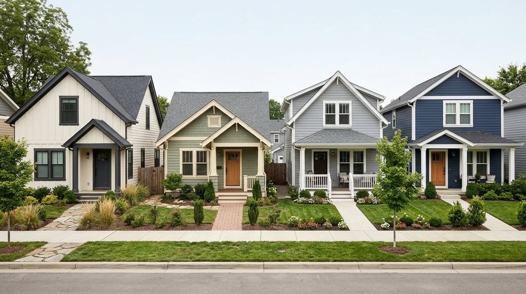
Looking at popular exterior house colors is a useful starting point, but choosing the right one for your own property requires a little more planning.
1. Start With the Roof Color
Your roof is one of the largest fixed elements of the house, so the wall color should work with it.
A charcoal or black roof can pair with warm white, gray, sage green, or greige. Brown roofing often works with beige, cream, olive, and earthy shades. A red or terracotta roof may suit warm white, sand, muted green, or other colors with compatible undertones.
These are starting points rather than strict rules. Look at the roof and wall samples together before deciding.
2. Consider Brick, Stone, and Other Fixed Materials
If your home has exposed brick, stone columns, or decorative masonry, treat those materials as part of the color palette. You do not necessarily need to paint every surface to make the exterior look coordinated.
For example, a home with warm red brick may look more balanced with a cream or warm gray painted section than with a cool gray that clashes with the brick’s undertones.
The same principle applies to concrete, metal roofing, and existing timber details.
3. Choose a Main Color, a Trim Color, and an Accent
A practical way to organize a palette is to assign each color a clear role.
| Color role | Where to use it | Example choices |
| Main color | Siding or large exterior walls | Warm white, greige, sage |
| Trim color | Window frames, fascia, and selected borders | Cream, white, charcoal |
| Accent color | Front door, shutters, or selected details | Navy, olive, muted blue |
You do not have to use three completely different colors. A main shade with a slightly lighter trim can create a subtle, coordinated appearance.
4. Check How Natural Light Changes the Color
Exterior paint does not look identical throughout the day. A wall in direct sunlight can appear brighter, while a shaded wall may look darker or cooler. Nearby trees, neighboring buildings, and reflective surfaces can also affect how a shade is perceived.
This is why the best exterior paint colors should be tested on the actual property rather than selected from an online image alone.
Apply sample colors to separate boards or suitable test areas, following the paint manufacturer’s directions. Check them in morning light, midday sun, and the late afternoon. View them from the street as well as from close up.
5. Think About Your Home’s Architectural Style
The same color combination can create different effects on different houses.
A modern home with simple lines may suit white, charcoal, greige, or a muted green. A traditional cottage may work well with cream, soft yellow, sage, or light blue. A house with decorative trim may benefit from a more restrained main color so that the architectural details remain visible.
You do not need to follow a strict style rule. The aim is to choose colors that complement the home’s existing proportions and features.
6. Consider the Surrounding Landscape
Trees, lawns, garden beds, walkways, and neighboring buildings all influence how your house exterior looks.
A muted green can blend into a leafy setting, while a warm white may create a clearer contrast. Homes surrounded by tan soil, stone, or dry landscaping may work well with sand, greige, or earthy brown shades.
Look at the property from the road and consider the view throughout the year, not just when the garden is at its greenest.
Modern House Colors: What Makes a Palette Look Current?
Modern house colors are not limited to black and white. A contemporary exterior often looks successful because the colors, materials, and architectural details work together.
Consider these practical combinations:
- Warm white and charcoal: A clear contrast that suits simple architectural shapes.
- Greige and dark bronze: A softer modern palette for homes with warm stone or brown roofing.
- Sage green and natural wood: A restrained, nature-inspired combination.
- Light gray and black accents: A defined look that works with clean window and roof lines.
- Navy blue and warm white: A deeper wall color balanced by lighter trim.
You can also create a modern appearance by limiting the number of accent colors and repeating the same trim shade around the windows, doors, and roof edges.
Popular Exterior House Colors: Should You Follow Trends?
Popular exterior house colors can provide inspiration, but a trending shade is not automatically the right choice for every home. A color that looks attractive in a professionally photographed house may appear different on your property because of lighting, roof materials, and surrounding colors.
White, gray, beige, greige, blue, and muted green are common options in exterior color collections. However, popularity varies by region, architecture, and personal taste.
Rather than selecting a shade simply because it is popular, ask three questions:
- Does it work with the roof and fixed materials?
- Will it look suitable in both direct sunlight and shade?
- Can you imagine living with it for several years?
For additional inspiration, browse the Sherwin-Williams exterior house color collection. It provides examples of exterior palettes and color combinations that you can use as a starting point. Remember that colors on a screen may not match the final painted result.
Exterior Details That Can Improve the Overall Look
Choosing the main wall color is only one part of planning a house exterior. Smaller details can affect how finished and coordinated the property looks.
Coordinate Gutters With the Exterior
Gutters can blend into the fascia and roofline or create a noticeable contrast. White gutters may work well with light trim, while a darker finish can connect with a charcoal roof or dark window frames.
If your home needs gutter maintenance, read our guide on how to clean gutters without a ladder. It explains cleaning considerations and safer ways to approach the task without climbing a ladder yourself.
For another exterior design detail, our article on half round gutters explains this gutter style and where it may fit into a home’s appearance.
Give the Front Door Its Own Role
The front door is an opportunity to introduce a small amount of contrast. Depending on the main exterior color, navy, muted green, natural wood, or a dark neutral may work well.
Before choosing a bold accent, check the door’s material and the manufacturer’s recommendations for suitable paint. A door exposed to strong sunlight or weather may need a product designed for those conditions.
Consider the Whole Property
Exterior colors should look coordinated from the street, not just in a close-up photograph. Pay attention to the garage door, porch, steps, railings, and visible foundations. If these areas already have strong colors or patterns, a simpler wall palette may create a more balanced result.
Your interior design and bathroom finishes do not have to match the exterior directly. However, if you are planning a broader home update, you may also find our guide to what is a 3/4 bath useful when reviewing bathroom layouts and terminology.
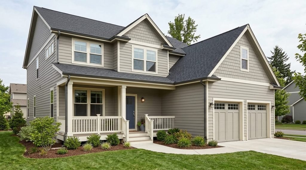
Common Mistakes to Avoid When Choosing Exterior Paint Colors
Even attractive colors can disappoint if they are selected without considering the full exterior.
Choosing From a Small Paint Chip Alone
A small sample does not show how a color will look across a large wall. Test larger samples and view them outdoors in different lighting conditions.
Ignoring Undertones
Two shades may both be called gray or beige but still look mismatched beside each other. Compare the samples with the roof, brick, stone, and trim rather than judging each color separately.
Using Too Many Accent Colors
A house can look cluttered when the door, shutters, trim, garage, and other details all compete for attention. Give each color a clear role and repeat it consistently.
Forgetting About the Existing Materials
Painting the siding will not change the color of an existing roof or exposed brick. Choose the new wall color to work with those materials, unless you are planning to change them as part of the same project.
Selecting Paint Without Checking Its Intended Use
Exterior surfaces face sunlight, moisture, and temperature changes. Use a paint formulated for the material and surface you are painting, and follow the manufacturer’s preparation, application, and drying instructions.
If the existing paint is peeling, the surface is damp, or the siding is damaged, deal with the underlying issue before repainting. Painting over a problem may not provide a lasting finish.
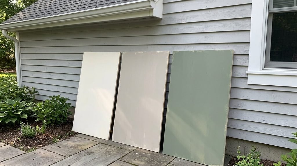
A Simple Checklist Before You Buy Exterior Paint
Use this checklist to make the final decision more confidently.
- Check the roof, brick, stone, and other materials that will remain unchanged.
- Select one main exterior color and one or two complementary shades.
- Test samples outdoors in sunlight and shade.
- View the samples at different times of day.
- Check how the colors look from the street.
- Confirm that the paint is suitable for the surface and local weather conditions.
- Estimate the paint quantity using the actual wall dimensions and the product’s stated coverage.
- Review surface preparation and application instructions before starting.
Taking these steps can help you avoid buying large quantities of paint in a shade that does not work once it is on the house.
Frequently Asked Questions
What are the most popular house exterior colors?
White, warm gray, greige, beige, muted blue, and sage green are widely used options. The best choice depends on your home’s architecture, roof color, surroundings, and preferred style.
Which exterior paint colors make a house look modern?
Warm white with charcoal accents, greige with dark bronze, sage green with natural wood, and light gray with black details can all create a modern appearance. Consistent trim and simple color combinations help complete the look.
Should the trim be lighter or darker than the exterior walls?
Either approach can work. Lighter trim creates a softer, traditional appearance, while darker trim adds contrast and emphasizes windows or architectural lines. Choose the option that complements the main wall color and existing materials.
How many colors should a house exterior have?
A practical starting point is two or three colors: one for the main walls, one for the trim, and an optional accent for the door or shutters. Some homes need fewer colors, especially when brick or stone already adds visual variety.
How do I choose exterior paint colors for a house with a dark roof?
Warm white, greige, beige, sage green, and some soft gray shades can work with dark roofing. Test samples beside the roof and trim to make sure the undertones complement each other.
Do exterior paint colors look different in sunlight?
Yes. Direct sunlight can make colors appear brighter, while shade can make them look darker or cooler. Test paint samples outdoors at different times of day before choosing a final shade.
What is the safest way to choose between two exterior colors?
Paint large sample areas or use sample boards, following the manufacturer’s instructions. View both options in sunlight and shade, compare them with the roof and other fixed materials, and look at the house from the street before making a final decision.
Should I paint the exterior myself or hire a professional?
That depends on the surface condition, height, preparation required, and your experience. Straightforward, accessible surfaces may be manageable for some homeowners, while damaged siding, difficult access, or extensive preparation may call for a qualified professional. Always follow product instructions and use appropriate safety precautions.
Final Thoughts
The best house exterior colors are the ones that work with your roof, existing materials, architectural style, and surroundings. Warm white, greige, sage green, soft gray, and navy blue all offer useful starting points, but no single shade suits every property.
Start with the features you cannot easily change, narrow your options to a small palette, and test the colors outdoors before buying paint for the entire house. A little planning can help you choose an exterior that feels coordinated, suits your taste, and remains appealing over time.